Colour Psychology in Home Decor: Choosing the Right Palette for Your UK Home
The colours we surround ourselves with have a profound impact on our mood, energy levels, and overall well-being. In the often grey and rainy climate of the UK, the colours we choose for our home interiors become even more crucial in creating a comfortable and uplifting living space. Understanding colour psychology can help you make informed decisions about your home’s palette, ensuring that each room not only looks beautiful but also feels right. Let’s explore how different colours can affect our psyche and how to apply this knowledge to your UK home.
The Basics of Colour Psychology
Before diving into specific colours, it’s important to understand that colours generally fall into two categories: warm and cool. Warm colours (reds, oranges, yellows) tend to energize and stimulate, while cool colours (blues, greens, purples) are often calming and relaxing. With the UK’s variable climate and often overcast skies, balancing these colour temperatures becomes crucial in creating a harmonious home environment.
Red: The Colour of Energy and Passion
Red is a powerful, attention-grabbing colour that increases heart rate and energy levels. In UK homes, it’s best used as an accent colour rather than a dominant hue. Consider using red in dining rooms to stimulate appetite and conversation, or in home offices to boost productivity. However, use it sparingly in bedrooms, as it can be too stimulating for restful sleep.
Blue: Calm and Serenity
Blue is associated with calmness, serenity, and clarity. It’s an excellent choice for bedrooms and bathrooms in UK homes, creating a tranquil atmosphere that counteracts the often hectic pace of British city life. Lighter blues can make small spaces feel larger and airier, perfect for the compact dimensions of many UK urban dwellings.
Yellow: Sunshine and Happiness
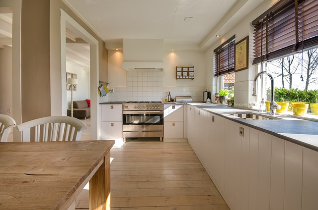
In a country where sunny days can be scarce, yellow brings a touch of sunshine indoors. It’s associated with happiness, optimism, and mental stimulation. Use yellow in kitchens, dining areas, or home offices to create a cheerful, energizing atmosphere. However, be cautious with bright yellows, as they can be overwhelming in large doses.
Green: Nature and Balance
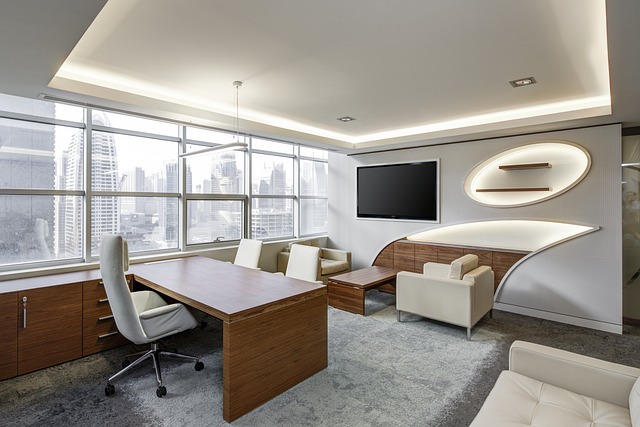
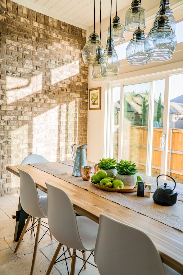
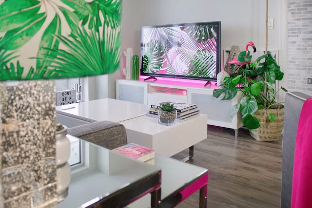
Green is the colour of nature, balance, and harmony. It’s a versatile colour that works well in almost any room of a UK home. In urban settings, green can provide a refreshing connection to nature. Use it in living rooms to create a welcoming atmosphere, or in home offices to reduce eye strain and increase focus.
Purple: Luxury and Creativity
Associated with luxury, creativity, and spirituality, purple can add a touch of elegance to UK homes. Deep purples work well as accent colours in living rooms or bedrooms, while lighter lavenders can create a soothing atmosphere in bathrooms or meditation spaces.
Neutral Colours: The British Classic
Neutral colours like white, beige, and grey have long been staples in British interior design. They provide a versatile backdrop that can be easily updated with seasonal accents. White can make small UK homes feel more spacious, while warm beiges create a cozy atmosphere perfect for the British climate. Grey, particularly popular in recent years, offers a contemporary look that pairs well with both warm and cool accent colours.
Applying Colour Psychology to UK Homes
- Consider Natural Light The amount and quality of natural light in your home should influence your colour choices. In north-facing rooms with cooler light, warm colours can help balance the atmosphere. South-facing rooms with plenty of sunlight can handle cooler colours without feeling cold.
- Reflect Your Personal Style While colour psychology provides guidelines, your personal preferences should always play a role. Choose colours that resonate with you and reflect your personality.
- Think About Room Function Consider the primary use of each room. Energizing colours work well in active spaces like kitchens, while calming hues are better suited for bedrooms and bathrooms.
- Use the 60-30-10 Rule To create a balanced colour scheme, consider using the 60-30-10 rule: 60% of the room should be a dominant colour, 30% a secondary colour, and 10% an accent colour.
- Test Before Committing Always test paint colours in your space before committing. The unique light conditions in your UK home can significantly affect how colours appear.
- Consider the Architectural Style For period properties, consider colours that complement the home’s architectural style. Georgian and Victorian homes, for example, often suit rich, deep colours, while modern apartments might benefit from a cleaner, more minimalist palette.
- Create Flow Between Rooms Ensure that the colours in adjacent rooms complement each other to create a harmonious flow throughout your home.
Conclusion
Choosing the right colour palette for your UK home is about more than just aesthetics; it’s about creating an environment that supports your well-being and lifestyle. By understanding colour psychology and applying it thoughtfully to your space, you can create a home that not only looks beautiful but also feels right for you and your family. Remember, the goal is to create a space that you love coming home to, especially on those quintessentially British grey days. Whether you opt for the calming blues of a coastal retreat, the warm yellows of a country cottage, or the sophisticated neutrals of a city flat, let colour psychology guide you in creating a truly personal and inviting UK home.